Building Keep Calm 3.3
August 12, 2014
Keep Calm is a fairly small app, clocing in at around 5000 lines of code. For my most recent update I decided to focus not on new features, but improving the user experience in simple but effective ways. I also removed a lot of code for iOS 6 (I had been using FlatUIKit on iOS 6, but not on iOS 7 - I’m no longer using any external dependencies). This post details the wide variety of changes that I made and some of the technical challenges that arose.
Color picker
The old version of Keep Calm had a bit of a rubbish colour picker that was essentially just three UISliders. The new colour picker is a dramatic change, and relies heavily on Core Animation and OpenGL ES. This is the first time I’ve shipped an app that uses OpenGL, although I’ve been playing with it since December 2012.
The structure of the control is really simple. There is an GLKView that draws the main saturation-brightness square. I had tried doing this using Quartz 2D, however this proved to be far too slow and after shifting around the calculations I was able to draw the square using GLSL in far less than a millisecond (the video is a little laggy, but the view runs at 60fps on a real device). Wikipedia has all of the formulas that you need to convert HSB to to RGB, however most implementations use branching (depending on which multiple of 60 the hue is between) however because branching should be avoided in shaders I therefore compile 6 separate programs that are generated at runtime. I had anticipated that this would be slow, however I’ve had now startup issues with the view.
The hue slider is made up of a static 1px wide image. This is created on the CPU using the formula described above (a simplified version of it, at least).
Finally, the two ‘loupes’ which appear on the hue slider and the saturation-brightness square are CAShapeLayers with a bunch of custom animations for when the user touches up and down. This is a really nice effect and works incredibly well on the device. It also makes it a hell of a lot easier to see the colour that you are picking out.
I have released the colour picker under the MIT license on GitHub.
Text editor
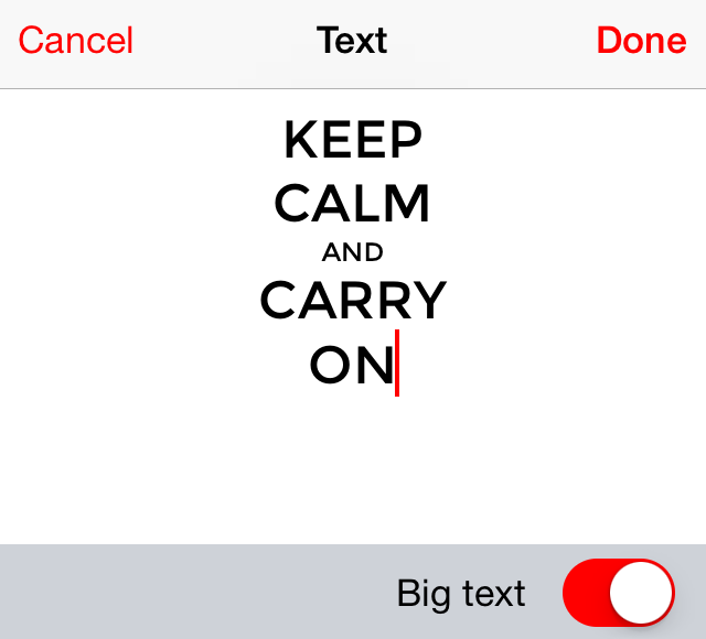
The new text editor is WYSIWYG, whereas the old one required you to begin ‘small’ lines with a lowercase letter:

This was really easy to write using TextKit and UITextView, however it wouldn’t have been possible using iOS 6 (hence why I dropped support for it). The only issue I ran into was the UITextView scrolling bug, however I managed to use this solution to fix it.
Slick UICollectionView
UICollectionView is an awesome class, and I’ve been using it since iOS 6 came out for my main grid of posters. Each cell contains a UIImageView of a thumbnail for each poster. I do this, rather than drawing each poster or using the poster view I use in my editor, because it has proven to be the least memory intensive and the fastest solution so far. The process for displaying images is fairly simple:
- The data source method is called to fetch the cell
- If the thumbnail for the poster is in a cache, then load it immediately
- Otherwise load it asynchronously and load it in a callback
However this still didn’t produce really smooth scrolling, especially on an iPad 3 or iPhone 4. These devices had a fairly similar CPU to their predecessors (iPhone 3GS, iPad 2), but four times the number of pixels (their GPUs are much better though) which means that loading images on them tends to perform a lot worse than their immediate successors (iPhone 4S, iPad 4). My new solution is to asynchronously load the thumbnails for cells a few rows ahead (or behind, if scrolling up) the current cell. This doesn’t produce a noticeable performance drop and ensures that posters are usually immediately visible when scrolling.
A framework for my apps
Since last October (with the release of Hipster Lab) I’ve been building a utility framework for use in my apps that simplifies a lot of common tasks. Keep Calm uses the latest version of this framework however most of the development on it this year has occurred as the result of a major update for Play Time that I’ve been working on. This framework will be available at some point on GitHub, but there is a lot I need to fix first.
Accessibility
I’d always held off putting accessibility support (for visually impaired users) into Keep Calm because I’d always thought it was far too visual an app, however I decided that it might be at least a worthwhile learning experience for me. I found that it was incredibly easy to add support and I encourage other developers to consider adding support into their app.
Keep it simple, stupid

A lot of Keep Calm relied on custom drawing code in order to render the poster. The main poster view was constructed of two custom CALayers with several hundred lines of Quartz code. Now I’ve just gone for three UIViews; one for the background (this can either contain nothing, a gradient layer or a UIImageView depending on background content), one for the crown (UIImageView) and one for the text (custom UILabel). The benefit of this over my previous approach is that it is now much faster - rotations are a lot more slick, for example.
The greatest lesson I’ve learnt from this version of Keep Calm is, by far, to just go with the simplest solution because this is often the one that works the best.
What’s next?
This fall I plan to release v4 of Keep Calm, as well as an update to the Android version. The next version will be iOS 8 only (I will probably do a bug fix 3.x version that supports iOS 7 and 8) which will include minor user interface changes and maybe an extension so that you can create posters from pictures directly within the Photos app. Keep Calm will continue to be developed in Objective-C for the foreseeable future (some of my apps will be getting a little Swift treatment thought) but I’m strongly considering Xamarin on the Android side.