TextMate is currently my favourite text editor, however the other day I tried opening a very large (~0.5GB) text file and TextMate ground to a halt, so I force quit it. Unfortunately, the next time I opened it I found that it kept trying to open the same file. Eventually, even after deleting the file completely, I managed to find a solution.
As well as its main preferences pane, there are a few additional preferences that you can set via terminal, and one of these prevents TextMate from opening the set of files it previously had opened. Run the following command in order to do so:
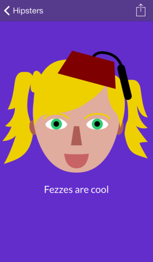
Hipster Lab 1.01 is now available for free on the App Store. This update brings improved sharing options; there is now a menu allowing you to directly share to your photo library, social networks or Instagram. It also resolves several bugs with ads and in app purchase.
For the last few weeks I’ve been working on a major update to Keep Calm for iOS. Version 3 is available on the App Store today. End users will get the benefit of the following new features:
Faster: The whole app is now at least 10% faster (in my tests on several different devices) across most features and around twice as fast in core areas such as importing images and saving posters
More logical: Rather than having to use the toolbar at the bottom of the screen to edit parts of the poster you can now just tap on the crown, text or background to edit it
More helpful: When you open a new feature for the first time (such as the main grid, the poster view or the text editor) a short alert that you can tap to dismiss will be presented
Change which lines of text are small: In previous versions of the app all three letter lines were automatically made smaller (this is based on the original Keep Calm and Carry On poster, where the middle ‘and’ line is half the height of the surrounding text) however you now have full control over which lines are made smaller - simply begin a line with a lowercase letter to make it small, and an uppercase letter to make it big
Share square posters for free: Previously when free users shared a poster to Instagram they would get a lower quality poster that was clipped on either side - maintaining the original aspect ratio. However, now all users can share high quality square posters
Bug fixes: I’ve aimed to make this version really solid, and there are far fewer bugs than before (it has been very rewarding going through Crashlytics and marking bugs as resolved). Provided that all goes well with this version, v3 will be the last major version with support for iOS 6 (I may do a minor bug fix version before a release that is iOS 7 only)
New welcome screen: Previously when you first launched Keep Calm you would see a four pane, spinning welcome guide to Keep Calm, however I’ve now reduced this to a far more subtle page that all users will see when first launching Keep Calm 3 (you will see it regardless of whether you had previously opened the app, this is because the App Store automatically updates apps in iOS 7 so users don’t see the what’s new description by default any more)
Better saving experience: Now when you save a poster to your photos from Keep Calm it will be added to both your Camera Roll and a special ‘Keep Calm’ album
Technical notes
I’ve rewritten the vast majority of both the model and view layers of Keep Calm for this release. The first major part of this was migrating over to a far simpler Core Data model - previously each poster was represented by seven different entities (mostly colours), however I’ve reduced it down to a single poster with five strings and five numbers representing each poster. Much better! This also has huge performance improvements - when changing a colour rather than having to edit three separate attributes in a separate entity only a single 32-bit integer needs to be manipulated now.
Migrating over to the new model was an interesting problem, and unfortunately I had to write a custom migration class that will migrate data over from the old model to the new model, which is done on the first launch of Keep Calm. In my tests this usually happens fairly quickly, and hopefully nobody will lose any of their posters!
Another big change with this version is that I’ve extracted and abstracted a lot of the core code that doesn’t do anything particular with the posters (colour manipulation, image saving, in app purchase, etc) into a new framework that I’m also sharing across Hipster Lab and hopefully my other apps in the future. The framework is fully documented and I hope to open source it under the Apache license at some point soon - it represents around 30% of the code in Keep Calm (but a much smaller percentage in Hipster Lab because there is a lot of custom drawing code there).
Advertising
Because I’m now giving away a previously paid feature - sharing square posters to Instagram - for free I’ve included ads via iAd in Keep Calm. I’ve aimed to make these ads fairly unobtrusive (they only appear at the bottom of the screen where the toolbar used to be). Back in the summer I did something similar on Android and the positive feedback of adding the Instagram feature in far outweighed the negative feedback of the addition of ads.
Android developers will be familiar with the concept of nine-patch images: images that have a resizable central area but fixed width and height images. This is incredibly useful if you have a resizable button that you want to use a custom texture as the background, for example. This has always been available on iOS (and is fairly easy to roll out with custom CALayers too) however Xcode 5 has helped to make the process a lot easier.
To begin using ‘image slicing’ (Apple’s name for it - probably because you can have three-patch and nine-patch) you’ll firstly need to begin using asset catalogues - which provides a new easy way to manage images in your app and I highly recommend you migrate to using them. Once you’ve created a new image catalogue for your image file you can press the ‘show slicing’ button to begin dividing your image (you can have it resizable in one or two dimensions, with a choice of horizontal/vertical/both slicing).
Using the image is incredibly easy - if you’ve got a UIImageView you can simply set it using:
//Using with an image viewimageView.image = [UIImage imageNamed:@"myimage"];//Using as the background to another view//Note that you will need to redraw the background when resizing//Therefore if you need to animate resizes it may be more sensible to add a UIImageView//as the background to your viewUIImage * myImage = [UIImage imageNamed:@"myimage"];UIGraphicsBeginImageContextWithOptions(myView.bounds.size, NO, 0);[myImage drawInRect:myView.bounds];UIImage * backgroundImage = UIGraphicsGetImageFromCurrentContext();UIGraphicsEndImageContext();myView.backgroundColor = [UIColor colorWithPatternImage:backgroundImage];
Unfortunately it seems a little illogical that you have to create a color from an image, but by drawing the image in a separate context it helps to ensure the image doesn’t become tiled.
In iTunes on your computer you are able to view the play count for an individual song. You could multiply the play count by the length of the song, however you would either need a spreadsheet or a lot of free time to do this properly. That’s where Play Time comes in.
Play Time is a new iPhone app (my eighth!) that I’ve been working on that makes it really easy to find out how long you’ve spent listening to a certain artist, album or song without the need to do the multiplication yourself. You can also found out how long you’ve spent listening to all of your music - I’m currently sitting at about two months…
In order to add a custom font file to your iOS application the most popular method is to usually use UIAppFonts key in Info.plist, however this method will allow you to automatically register fonts by going through Core Text:
Obviously if you’ve only got one custom font that you are going to be using in your application then there is little point in using this method, however it is a neat time saver if you are working on a project where you are testing lots of fonts or if you are shipping with lots of fonts.
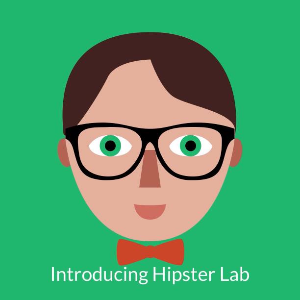
Hipster Lab is a new app that I’ve been working on that allows you to create custom cartoon ‘hipsters’ that you can easily share on social networks or use as your avatar. Hipster Lab contains dozens of custom glasses, moustaches, bow ties, hats and hairstyles that allow you to create over 50,000,000 unique hipsters.
Whilst Hipster Lab is free, it is also ad supported (this is the first time I’ve done this on iOS - it is an experiment more than anything else) with the option to remove ads (if you attempt to do this on iOS 6 v1.0 of the app will crash - I’m putting out a fix for this in the coming week).
On a coding note - Hipster Lab shares a lot of code with Keep Calm, and I’m in the process of slowly tidying up all of the shared code and documenting it so that hopefully I’ll be able to publish it to GitHub later this week.
When Apple releases new versions of iOS they often add new default fonts, and iOS 7 is no different - although maybe especially notable for its thin variants of Helvetica Neue, which is one of almost 40 new font styles added in iOS 7. The following list was generated by listing the fonts on an iOS 6 device with a couple of handy methods on UIFont, doing the same on iOS 7, finding the differences with a simple Python script and then creating a simple table view which I screen shotted. I’ve also got the full lists on my GitHub account.